
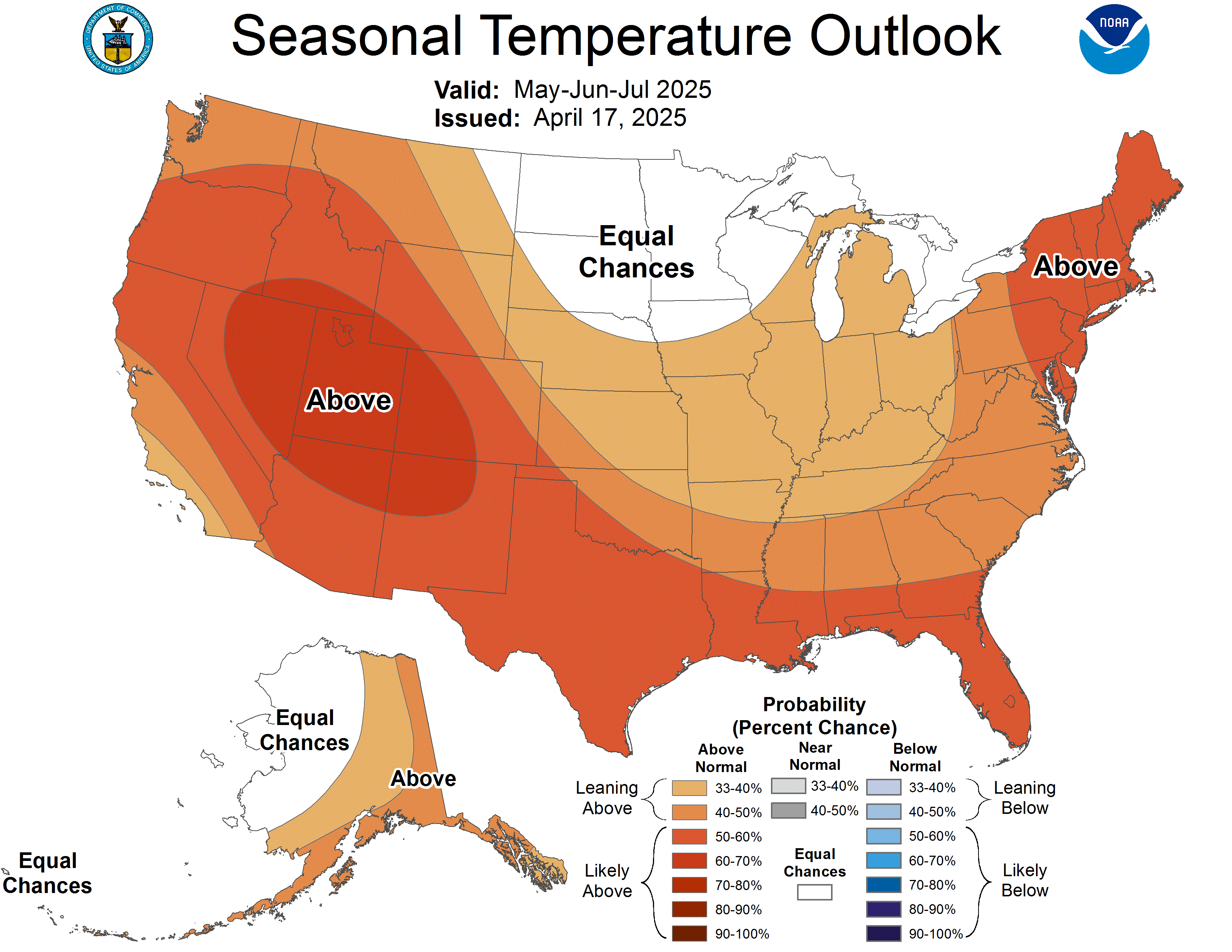
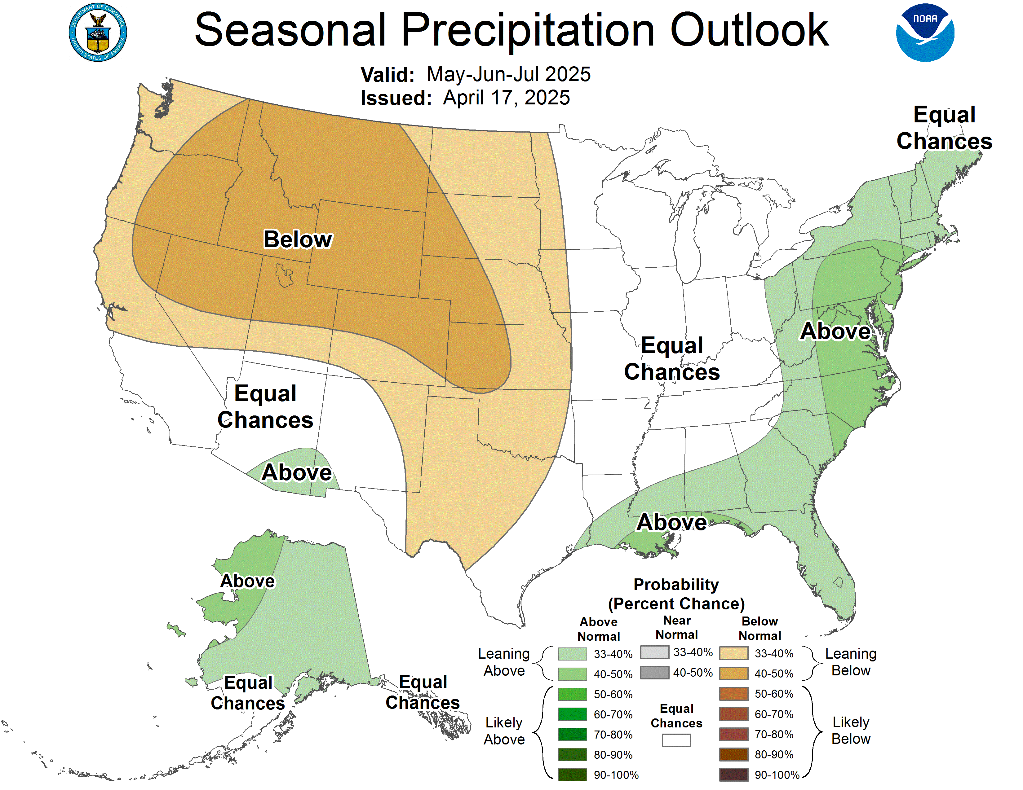
Seasonal Forecast
Temperature
|
Precipitation
|
How to Read the Seasonal Forecast Maps
A seasonal forecast is often presented by comparing the expected conditions in the coming months to the long-term average conditions during those months (based on recent 30-year monthly averages). Seasonal forecasts are regularly provided as maps with shaded areas indicating the most likely of 3 categories: above average, near average, and below average for seasonal precipitation and temperature.
The 90-day seasonal forecasts of precipitation and temperature are made based on ENSO phase (El Niño, La Niña, Neutral), recent climate trends, soil moisture, and several other factors. The accuracy of these forecasts is generally greater than just using the climate normals (averages from 1981-2010) to forecast climate.
The shaded areas on the maps below show the probability (how likely as a %) that precipitation or temperature is above normal (A), about average (N), or below normal (B). For each location and month, the coldest (or driest) 10 years from the 30 years of 1981-2010 define the “B” below normal category, the warmest (or wettest) 10 years define the “A” above normal category, and the remaining 10 years define the “N” normal category. Without any forecast, the chance of conditions being in each of the 3 categories is 33.3%. With a forecast, based on ENSO phase and other factors, shading is used to show areas where probability is greater than 33.3%. At any location on the map the probabilities for each of the 3 categories (above normal, near normal, or below normal) adds up to 100%.